How to Use Purple in Interior Design?
Purple is a bold and unique color that can be used to make a statement in any interior design. From deep purple walls, or pale lavender walls, you can almost never go wrong with a purple color palette. When used correctly, purple can create a dramatically beautiful environment that stands out from the ordinary.
This guide will show you how to use purple in your interior design wisely and effectively, exploring the best color combinations with purple for an overall stunning finish.
Color Theory and Purple
The color purple has been used in interior design for centuries and has a deep, symbolic meaning. It is a combination of blue and red and so carries with it both the energy of these two colors, and it has gained the status of a mythical and spiritual color.
Understanding the basics of color theory is an important part of using purple in interior design, as it helps create the best color combination with purple for the desired effect.
Let’s explore color theory and its link to purple.
Color Wheel
When choosing a color, it is beneficial to understand basic color theory and the color wheel, which is a tool used to identify what colors work together. Colors that are opposite from each other are called complementary. Colors that appear side by side are known as analogous and they usually create an especially harmonious effect when combined in interior design. For example, if you wish your home to have a unified mood, you can go with a combination of different purple colors, i.e. a purple color palette.
Using the color wheel can help you choose the best color combination with purple. As purple is part of the cool family, its complement on the wheel is yellow, an equally intense yet warm hue. A mix of both these colors in their deepest versions creates a captivating contrast that livens up a space. Gold accents boost this dynamic combo perfectly — adding flashes of light and balance out the depth of murky hues in damask wallpaper or deep velvet seating. It’s best to keep accent furniture neutral, such as gray tones, and blend golden tones subtly through accessories like wall art or mirrors for creating focal points without brightening up your palette too much!
Alternatively, shades from a single color family pair brilliantly with purple, too — tones such as lilac and pastel pink have become very popular in recent years thanks to its soft elegance when combined with dark, soft purple or gray-ish purples. Add some modern touches like copper lamps or dark wood shelves for extra personality!
Color Psychology
Purple is the color of royalty, luxury, extravagance and fantasy. It’s also very versatile in that it can be either complementary or contrasting depending on the mix of opposites you choose. Getting the right color combinations with purple will give your interior design an extra punch of sophistication and create a look that is surprisingly modern and sophisticated.
When it comes to purple, there are three popular color pairings to choose from: cool blue and white, yellow and black, or warms reds and oranges. You can also go for a more unique look, like combining deep purples with green accents.
For example, combining cool blues with a touch of white creates a soothing backdrop for the rich textures of a deep purple sofa or bedspread. Or if you’re looking for more drama, opt for yellow accent pieces with contrasting black accents to add depth to all-purple interiors. Using warms oranges and reds can create an inviting atmosphere that also stands out against restful shades of lavender or lilac.
No matter what combination you decide works best for your space, embracing bold colors like purple in interior design will always add a touch of indulgence, intimacy and poise to your decorating scheme while adding personality too!
Dark Purple or Light Purple? The Interplay of Different Shades of Purple
The spectrum of colors is made up of hues, tints, shades and tones. In the case of purple, there are several different shades to choose from within the overall family. The lightest shade is lavender and from there, intensifying tints create colors such as thistle and heather, followed by soft shades with like amethyst, periwinkle and mauve. Darker tones that almost become black include eggplant and plum.
Saturation is also important when it comes to choosing paint colors for a room that uses purple as its main hue. Less saturated hues will reduce their impact on the overall look while more intense colors can create a more vivid atmosphere if used correctly. Consider using lighter or darker shades to emphasize shapes in your interior design scheme or use different textures to really bring out the colors you have chosen.
When combining other colors with purple in your space, think about introducing warm neutrals such as beige or gold to add depth without taking away from the overall décor theme.
Other great options include olive greens and soft blues that contrast nicely with rich purples while still creating a rather peaceful atmosphere. Using various shades for just the right amount can also provide for a unique look. For example, if you wish for a more vibrant look, go for bright reds or fiery oranges paired with purple paint — this works well when trying to create something modern or eye-catching in an area of your home.
Purple Walls, Yes or No? Best Color Combination With Purple
As one of the most popular colors in interior design, purple can bring a unique beauty to any room. Soft purple walls can emanate a cozy and warm touch. This color combination creates a mood for relaxation, peace, and pensiveness.
But to get the best results, you need to pair purple with the right color combinations.
In this article, we will discuss the best colors to use when decorating with purple. We’ll look at popular color combinations, as well as a range of matching shades and tints to create the perfect ambience.
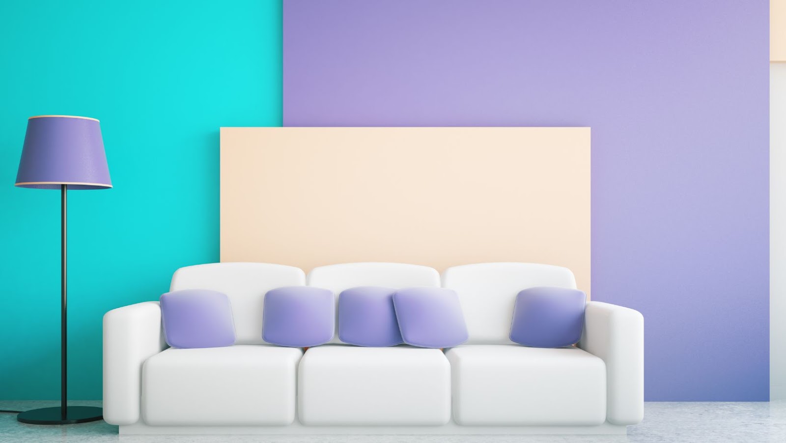
Purple and White
Purple and white is a classic combination of colors and a safe choice for interior design. It creates a distinctive, traditional look and can also be used to create modern, minimalist designs. White helps to bring out the brightness and vibrancy of purple without overpowering it, making this a popular choice for bedrooms, bathrooms or areas requiring subtle shades.
For example, a traditional white settee accented with purple scatter cushions would bring both elements into any room without looking too kitsch. Alternatively, white decorations could be used in an all-purple room to create accents of contrast, especially if combined with royal purple.
Throughout history many cultures have celebrated the symbolism of purple and white – making them particularly appropriate choices for weddings or special occasions.
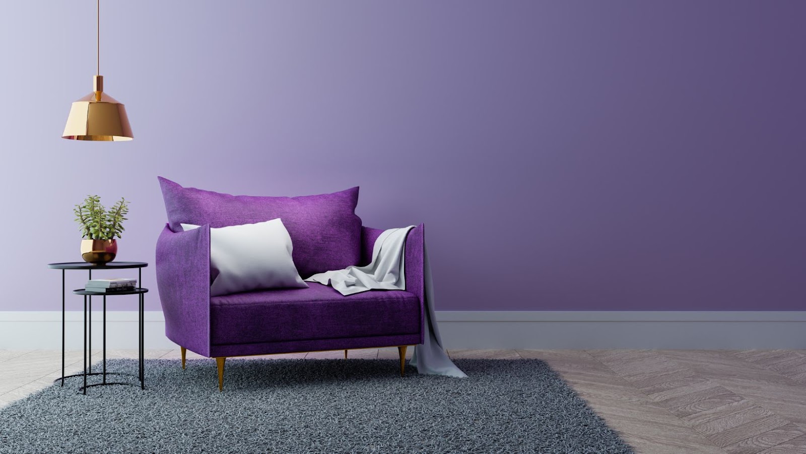
Purple and Grey
The cool tones and muted shades of grey can make a perfect foundation for purple to be displayed in. Choosing different shades, tints and tones of grey can offer a range of options from subtle to bold.
Purple and grey can be used together when creating a low-key statement by accompanying your purple with pale shades of grey or make more of an impact by contrasting dark purples with light greys. Grey can help give the hue more versatility and versatility, allowing it to be used in many different scenarios as an accent color or in creating a full monochromatic look. If you want an especially subdued mood, combine soft lavender with gray tones.
When combined correctly, this pairing creates a sophisticated and modern look that will satisfy any aesthetic preference!
Purple and Yellow
Purple and yellow are complementary colors, making them a great choice for pairing. This duo often has connotations of royalty, as purple and yellow have been used in rich colors, fabrics, and architectural elements of luxurious palaces throughout the centuries. Both purple and yellow hold the status of being a regal color, so pairing these complementary hues can really give your space depth and make for an impressive room area under natural light.
This combination can be used to create an air of sophistication or to simply add some bold décor to a space.
The hue and intensity of both colors will determine the overall effect you want to create when using this color scheme. As a general rule, use brighter tones and pure shades if you want to make a statement rather than choose softer shades for a room that’s meant for calmer activities.
Yellows range from bright lemon yellows through soft wheat colors and buttery cream yellows can be paired with deep eggplant purples through lavender tones for either vibrant or calming look.
Both colors also mix well with other hues like navy blue, blue, blue lilac, or red and green when looking at more nuanced color palettes. Using variations on each one—such as ultramarine blue or earthy olive green—will deliver an intriguing depth when offset by the vivid pair of purple and yellow.
For example, while an eggplant tone works beautifully against yellowish-tan walls, adding emerald green decorations or throw pillows of a soft French blue will add another layer of interest to your design palette without detracting from the original dynamic between purple and yellow.
Purple and Blue
Purple and blue is a classic combination that can instantly transform any interior space. The intensity of the purple color should be balanced with a paler shade of blue to provide a relaxed, but still vibrant atmosphere. This calming contrast can be used as an overall color palette or highlight specific items within the space. For example, blue pillows can be added to a purple couch to make a bold statement while retaining tranquility in the living room.
Purple and blue can have neutral shades as well, making it easy to combine with other colors. Dark gray or brown accents will create an elegant look that emphasizes its sophistication. On the other hand, bright white creates a more modern appearance, emphasizing simplicity and crispness. It’s also possible to use lighter blues alongside darker purple tones for contrast. This can make for eye-catching displays, particularly when used with translucent materials like glass or fabrics adorned with a light sheen. With its wide range of tones and tints available, this unforgettable combination is one of the best ways to add color to any room.
Purple and Green
Purple and green is one of the best color combinations with purple because it is fresh and invigorating, simultaneously calming and energizing. This palette works well in any interior design space. Whether you use tones of deep emerald or muted mint greens, or deep purple such as bright eggplant or powdery lavender, both colors bring vibrancy and dynamic energy to a room. Plus, the combination of colors is perfect for any season – it looks just as good in a rich Fall palette as it does in a light Spring setting.
When using this dynamic duo together you can go bold by selecting complementary tones with high contrast, or opt for softening the look of either color by selecting opposing hues on the color wheel that range from light to dark. Try pairing olive green with lilac or sage-green walls with violet fabrics to get the look. Matching furniture like sofas and armchairs with green velvet covers and purple wall accents to carry out this look effectively.
Another way to create luxe interiors with purple and green together is through accent pieces like carpets, throws, cushions and artwork – split complementary shades provide a more modern finish compared to tonal variations which tend to appear softer in nature.
Don’t forget about your lighting choices too; select matching pendant lights in each color for an interesting eclectic scheme that will make your interior pop! Whatever scheme you decide upon, this powerful color match-up is great for creating an atmosphere full of warmth, texture and luxury that won’t disappoint. Just… go with purple.
Tips for Using Purple in Interior Design
Incorporating the color purple into your home design can add a touch of sophistication and luxury to any space. However, it’s important to find the right balance when it comes to using this color. With the right combination of shades and hues, you can create a stunning, stylish look that complements the other elements of the room.
Here are some tips to help you get the best results when using purple in interior design.
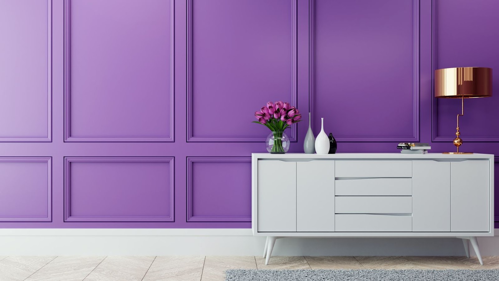
Choose The Right Shade of Purple
When using purple in interior design, it’s important to consider the different shades available. The wrong shade of purple can make a space feel overwhelming or off-putting; on the other hand, finding the right shade and coordinating with complementary colors can create an atmosphere of warmth and encouragement. It is important to remember that what may work in one space may not work in another.
Harmonious Color Combinations With Purple
To ensure balanced harmony, choose soft or muted shades such as light lilac or lavender for a relaxing feeling; deeper shades such as plum and eggplant for drama; and bright shades like magenta to create an energizing effect.
When pairing purple with other colors, keep in mind that the deeper the shade of purple, the more muted tones are typically best for coordination. A great way to soften bold purples is by adding warm woods or metallics like gold, bronze or copper into your interior color palette.
Exciting Color Combinations With Purple
Other great combinations include browns and creams; beiges; blues and creams; navy blues; tans and browns; vibrant citrus hues such as orange and yellow; silver tones combined with light purples like lavender; bold greens mixed with warm purples like eggplant; classic reds mixed with light mauves or plums; deep burgundies mixed with off-whites and beiges; whites framed by deep violets (think drapes against a bedroom wall); and dark greys combined with almost any hue of purple. Experimenting with different combinations can lead you to achieving absolute perfection.
When to Choose Complementary Colors
Purple is often referred to as a mysterious hue and is known for eliciting strong emotional responses. Because of its ability to inspire strong emotion, it’s best paired with colors that create a calming atmosphere in interior design.
Combining purple with soft colors like white and light neutral colors such as beige, taupe, grey and soft French blue creates a setting that’s helpful in bringing out the richness of purple without overwhelming it. Soft blues are also complementary colors that pair well with purple without overpowering the room.
For a modern look, deeper shades of green like teal and hunter green are great color combinations that add contrast while still keeping the room grounded. Finally, metallics such as silver or gold can add an elegant touch of glamour when used appropriately with purple which makes it ideal for luxury designs.
Of course, any contrasting colors will work with purple provided they are used sparingly in equal amounts so as not to overpower the room or create an overly busy atmosphere.
Balance The Colors in The Room
Using purple in a room can be difficult if you’re not sure how to go about it. Especially when you want to create a more sophisticated and stylish interior design. The best way to achieve this is to balance the colors in the room.
Too Much Purple?
But sometimes, too much of a single color, even one as fascinating as purple can be “too much of a good thing.” Sometimes, what you need is balance, or just adopting a “less is more” approach.
You can start by understanding your options for creating balance. Think of a warm color palette with beige and white walls that produce light tones that soften the strong shade of purple.
Or, depending on the light coming into your home, you could opt for cooler combinations such as blues, greens or grays – they provide an intense contrast which will create drama and set off your purple furniture pieces or walls in a beautiful way. Warmer shades like yellow and orange usually clash with this regal hue, so try to avoid them at all costs.
Purple Furniture Pieces
In terms of furniture pieces, try opting for neutral or metallic tones that naturally enhance the strong shades of purple found in fabrics and artworks. You may also want to consider complementary opposites on the color wheel like black, silver or gold – this will surely grab attention when it comes to accessorizing a room with different textures and materials such as pillows or curtains.
When it comes down it, remember that when creating your ideal interior design using purple hues it all depends on good planning – where less is often more. Stick with solids or add light accent colors like beiges, whites and other neutral shades so you don’t overwhelm any part of the room while still making quite an impact!
Conclusion
To sum up, the best color combinations with purple depend on the particular shade you choose. A deep purple, like Aubergine or eggplant, works especially well when combined with neutral colors like beige, gray, and white.
To add more warmth to the space, add touches of other deep colors such as burgundy or deep blue. For a lighter look mix in pastels such as yellow or green to soften the space. And finally don’t forget accent colors such as gold and silver which give your interior design an added layer of glamour and sophistication.
Your interior design should express your personal style and taste so go ahead, just use purple and have some fun experimenting!